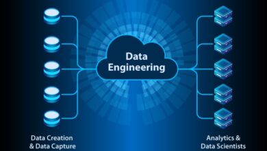
Knowledge graphs – and their basic data structure ancestors, graphs – have taken center stage at enabling knowledge management systems as well as knowledge as a service (KaaS). At their simplest, graphs are composed of entities (nodes) and relationships (edges). Schemas dictate what types of relationships (facts) can be attached to each entity type. And new fact types can be added “on the fly” to accommodate the structuring of un or semi-structured data streams and changing fact types of interest (think, “wild” web data).
For many knowledge workers, the most common graph-centric form of data they see is literally a graph. That is, a visual graph representation. And the underlying graph structure is just one data source among many used by data teams or for machine learning.
Working at Diffbot – maker of the world’s largest commercially available Knowledge Graph – we see many graph visualizations. And regardless of graph data’s use for incorporating external data into apps, structured data source for data teams, and machine learning use, the visuals themselves aren’t often that insightful.
With this said, there are a variety of data insights that are only possible with graph visualizations.
We’ll be working through some of these insight types that graphs make possible below. But before we jump in let’s talk about some of the broad benefits graph visualizations confer.
First, graphs enable the tracking of many more relationships than most human minds can map. Miller’s law states the average human can hold about 7 (plus or minus 2) facts in their working memory at once. If a single relationship has a type and links two entities, this is three of our 5-9 facts we can hold at once. With graphs, hundreds of connections can be comfortably surveyed visually.


Caption: Automotive supply chain data in a visual graph from Neo4j
Secondly, graphs utilize the sensitivity of our sight across an arbitrary range of data types. While most traditional chart types plot 2-3 variable types, graphs can incorporate a wide range of data types so long as they fit the broad categories of entities or relationships between entities. The ability to plot visual clusters, distances, or values across a range of entities can more quickly inform viewers where they should investigate further.

Even single articles can contain more concepts than we can mentally map. Source, Diffbot Natural Language API Output.
Third, graphs can plot rough similarity and proximity, even if no direct relationships between entities exist. For example, in a graph of investments within an industry two organization entities that share 6 investors may be visually clustered even if no direct relationship between the pair exists.
Finally, graph visualizations often enable the derivation of insights followed by the ability to dive into another facet of the exact same data set. This leads to highly efficient investigation. What I mean here is that graph visualizations are often created with a selection of relationship types (among others) as well as entities that exhibit a particular facet. The underlying dataset often includes many additional field and relationship types standing by.
With these common features of graph visualizations covered, let’s jump into specific insights that are only possible with graph visualizations.
Point of Failure Or Risk Visualizations

An illustration of linked graph data used in Contingent.AI’s Supply Chain Risk Platform
Graph visualizations are the creme de la creme of monitoring risk in spaces where manifold data types inform risk. Take supply chain risk where a viewer may be monitoring suppliers of different types as well as their suppliers. For each they may contain different changeable risk factors (events, financial stability, sentiment, regulations). The ability of knowledge graphs to add new fact types “on the fly” is a major selling point for uses like supply chain monitoring for this very reason.
Fraud Investigation Visualizations
Criminal masterminds and their law-abiding inspector counterparts are often shown creating physical representations of graphs in entertainment. Digitally, a much wider range of input types can be modeled. Fraud investigation uses of graph visualizations circles back to our point in the first section about proximity and similarity.
Let’s say a financial fraud investigation is underway. A series of shell companies through which finances passed may have been opened by a seemingly unrelated string of individuals. And yet relationship data in graphs provides the potential to locate the common link. An individual with a relationship to each of the individuals starting a shell company is certainly worth investigation, no?
Influencer Visualizations

A Neo4j graph visualization populated with Diffbot Knowledge Graph Data on crypto influencers. Each Node can be expanded to see fields like news mentions.
One defining characteristic of knowledge graphs is that each entity has a unique identifier, allowing for disambiguation and proper merging of data from many sources. This is particularly useful in news monitoring, where the velocity and range of mention types surrounding an entity can create noise in other visualization types.
The presentation of influencer information including sentiment, number of quotes, and mentioned entities can lead to powerful visuals useful in media monitoring, public relations, as well as investing.
Where Graph Visualizations Excel
Graph databases power an ever growing number of market intelligence, machine learning, and recommendation system applications. And they lend themselves to being visualized. But though graphs are great at holding huge numbers of connections between various data types, visualizations often suffer from lack of usability and clarity. However, for a handful of use cases graph visualizations are in fact the usable end product. Some of the most highly regarded uses of graph visualizations include fraud detection, supply chain and risk monitoring, and influencer monitoring.