My first post on art is about Josef Albers and his use of color. An idea central to his work is that we do not see “individual” colors — but colors are always perceived in relationship to the surrounding colors.
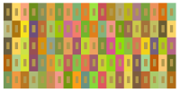
Look at this image for a moment — what do you notice about the smaller rectangles? If you look carefully, you’ll notice that they are all the same color. It may look like some are darker than others — but that’s only because you’re seeing them against different background colors. Albers explored this idea in depth in his famous book, Interaction of Color.
So how can you create this image? Begin with a color specified as RGB — in this case, (0.7,0.6,0.3) — to use as the color of the smaller rectangles. Remember that (0,0,0) is black and (1,1,1) is white; using values for R, G, and B between 0 and 1 will allow you to produce millions of different color combinations.
Now use your computer’s random number generating ability to create three random numbers between -0.3 and 0.3. For this example, I’ll use -0.2, -0.1, and 0.3. Subtract these values from (0.7,0.6,0.3) to get the RGB values for the left larger rectangle — you get (0.9,0.7,0.0). Then add these random numbers to (0.7,0.6,0.3) to get (0.5,0.5,0.6) — these are the RGB values for the right larger rectangle. Notice that this procedure assigns RGB values to the smaller rectangles which are the numerical averages of the RGB values of the colors of the surrounding rectangles.
Keep in mind that this is an arithmetic mixing of colors. If you actually had paints which were the colors of the larger rectangles, mixing them would likely not give you the color of the smaller rectangles. Also keep in mind that Interaction of Color was published in 1963, so that Albers’ ideas were developed with paper and pigment. What I’ve done is adapted Albers’ ideas for use on a computer — and interpreted his ideas as you see here. Color theory is a very complex field, and is widely written about on the internet — so if these ideas intrigue you, start searching!
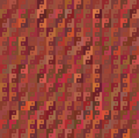
As a final example, here is a piece incorporating these ideas about color with an abstract yin/yang motif. Visit my art website if you’d like to see some additional images with commentary.
Now we’ll get to the specifics of actually implementing the ideas mentioned above. I’ve decided to use Python for these examples since it is a language growing in popularity and is open source. Also, I’m using Python in a Sage environment because it’s open source, too — and you don’t need to download or install anything. You can just open a Sage worksheet in your browser. Sometimes it’s a little slow, so be patient. You can download Sage onto your own computer if you’d like to speed things up.
Here is the link to the interactive color demo. It’s fairly self-explanatory — and you don’t need to know any Python to use the sliders. Just hit shift+enter as explained in the instructions.
One thing to be careful about, though. If you choose a red value of 0.8, and then choose to vary this value by 0.4 — you’ll get red values of 0.4 and 1.2. But since RGB values are between 0 and 1, the 1.2 is “truncated” to 1.0, so you’re really working with 0.4 and 1.0. This means that 0.8 is no longer the average of the two red values — so the “Albers” effect won’t be so pronounced, and may be absent if your values are too far off. Select your values carefully!
I’ve tried to make the code fairly straightforward, so if you know a little about Python or programming in general, you should be able to make some of your own changes. You’ll have to make a Sage account and copy my code to one of your own projects in order to make changes.
This blog is designed to give you ideas to think about, not be a tutorial. So I won’t be teaching you Python. If you need to understand the basics of the RGB color space — well, just look it up. There’s also plenty online about Josef Albers. Go in any direction you like.
But if you are going to play with the Python code to make more complex images, here’s a suggestion. Whenever you are about to type in RGB values, pause for a moment and ask why you’re choosing those particular values. Use color deliberately. This will make all the difference in the world — and may well be the difference between making a digital image, and creating digital art.


3 thoughts on “Josef Albers and Interaction of Color”