Cold, windy and definitely Wintery, it was really the perfect day to visit the John Virtue exhibition “The Sea” which recently opened at the Towner Gallery in Eastbourne. I have been rather looking forward to this particular show, although disappointed that I missed the “in conversation” afternoon talk between Virtue and Andrew Graham-Dixon. John Virtue first came to my attention back in 2005 when he had an exhibition at the National Gallery to showcase the work he had produced while in post as the National’s 6th Associate Artist. These monumental black and white paintings have had a lasting effect on me, and I think that probably deep down they have seated themselves in my brain as a sort of benchmark for mind-blowing contemporary painting.


Above: John Virtue London paintings (from postcards available from the National Gallery exhibition, 2005)
In the London paintings I was moved by the ‘mood’ of the paintings, the depth of the black is incredible, evocative of the well-known London smog from the 1950’s, but where contemporary buildings such as The Gerkhin emerge, bringing the viewer sharply back into the 21st century. At the same time as the National exhibition, just up the road at the Courtauld Gallery was a smaller show of some of the sketches he made during his tenure at the National and which were the basis for the massive paintings on display there.
Virtue only ever works in black and white, finding colour a distraction. Apparently he uses shellac black ink and white paint, this probably accounts for the velvety depth of the black in his work. Scale is obviously important to him. Influenced by the great English landscape painters including Turner and Constable, his work has also been compared to the American Expressionists and also Japanese brush painting.
The current exhibition at the Towner shows 12 large canvasses, and by large I mean very large indeed – at a guess 15 feet plus by 8 or 9 feet plus, these are huge! Of course, the subject matter is also equally vast, so it seems fitting that scale comes into the equation. The exhibition is the culmination of several years worth of walking the same stretch of coastline in Norfolk, pausing from time to time to make simple quick sketches in a tiny sketchbook. (A large cabinet in one of the display rooms hold these sketchbooks piled up on top of each other, there are over 100 of these tiny A6 sized books each with the pages covered in fast sketches). From these sketches the artist has built up his monumental canvasses, layering paint and ink, building up, knocking back, smoothing, scratching the medium creating textures and forms within the painting, unidentifiable individually, but when seen together they combine to create dramatic visions of the North Sea. The expressionistic nature of the work reminds me of Turner’s later work and is highly emotional. Of course the abstract nature of the work can be challenging, but I think that is a good thing, this is the sort of work that demands to be looked at, really looked at as the more you look, the more you see.
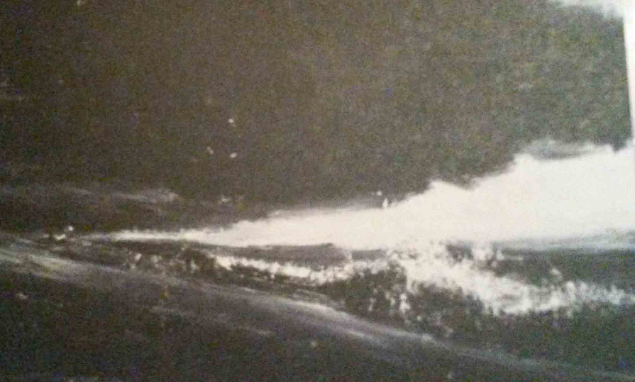
John Virtue, The Sea painting no.4 2011-13
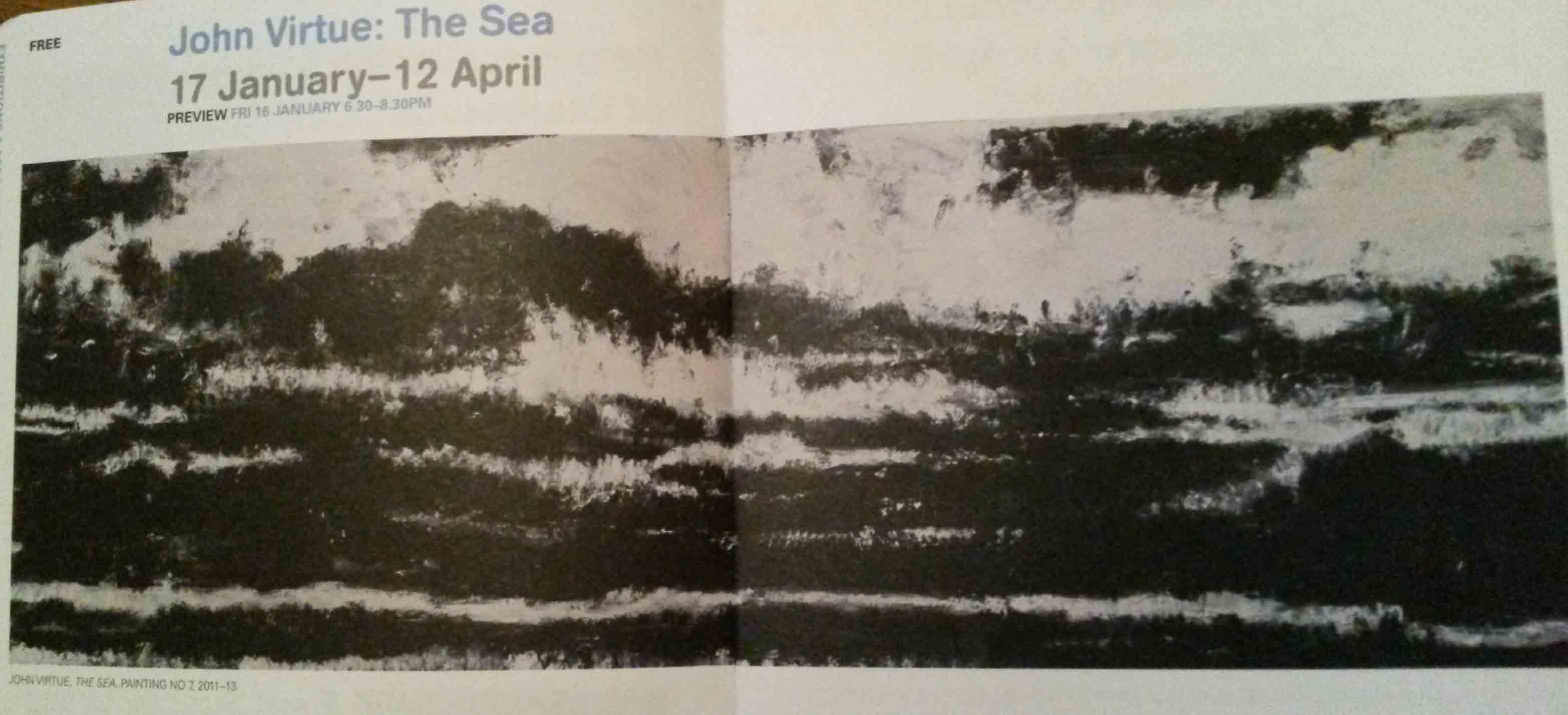
John Virtue, The Sea painting no.7 2011-13
(images from the Towner Gallery Winter/Spring programme booklet)
The exhibition “John Virtue – The Sea” is open at the Towner Gallery, Eastbourne, East Sussex from 17th January to 12 April 2015. Admission is free.
