The book on color that never fades

He had blossomed in the Bauhaus, fled the Nazis, epitomized the zeitgeist at Black Mountain College, and infused the Yale School of Art with the spirit of experiment.
He’d also produced a vast and growing series of artworks that would land him squarely among the giants of modernism.
And when, in 1958, at age 70, the German émigré Josef Albers retired from the Yale faculty, legacy-defining professional triumphs were still to come.
Prominent among these was his book “Interaction of Color,” a revelatory work about color perception published in 1963 by Yale University Press.
Initially produced in a highly unusual format — a limited silkscreen edition consisting of two large, unbound volumes with 150 color plates, weighing 22 pounds — the book would become a classic guide to visual awakening, hailed by one early reviewer as a “grand passport to perception.”
Now on the cusp of its 60th anniversary, “Interaction of Color” ranks high among the Press’s all-time bestsellers — fifth among the current top 10, with well over half a million copies sold to date. The book has been translated into at least 17 languages, including Chinese, French, German, Russian, and Spanish, and it continues to sell steadily in print and digital formats.
“People need delight,” said Nicholas Fox Weber ’72 M.A., executive director of the Josef and Anni Albers Foundation, who has written extensively about Albers and is now at work on a Yale Press biography of his wife, the textile artist Anni Albers.
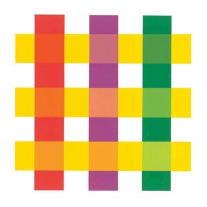
“Interaction of Color” offers delight and insight through mind-bending exercises, examples, and experiments, leading readers to a direct and visceral experience of color’s infinite subtlety and contextual dependence. The examples are drawn principally from Albers’s collection of student responses to his classroom prompts: with colored paper, make one color look like two, make two different colors look alike, make three colors look like two.
“All color perception is really illusional,” Albers told the Associated Press a few months after the book first came out. “That’s the theme of my book.”
Albers, who led the art school’s design department for nearly a decade, wasn’t the first to grasp the phenomenon. But his presentation of it gave readers a direct, structured, and personal way to explore color’s complexity — moving them beyond passive recognition of its dynamism to a visceral and active understanding.
Anoka Faruqee, associate dean in the Yale School of Art and a member of the painting and printmaking faculty, often uses “Interaction of Color” in her color course.
“Initially there can be some confusion or mistrust,” she said of students’ reactions to the book and its exercises. “Because color is so fluid and perceptual, [they think] there’s some kind of gimmick or trick or ruse. But it’s a productive mistrust. And then they get really excited when they realize that this is how color operates.”
In addition to a mass-market paperback edition, “Interaction of Color” has also proved well suited for digital adaptation and to companion texts. The Press introduced an iPad app in 2013, an eBook in 2020, and an interactive web version in 2022. A print workbook by artist Fritz Horstman, the education director at the Albers Foundation, is scheduled for publication in 2024.
“We’ve tried to keep the project and the spirit of it alive,” said Press Director John Donatich.

The unusual format (large and unbound), high retail cost ($200, or nearly $2,000 today), and defiantly limited original 1963 printing of “Interaction of Color” — 2,000 copies, “and there will never be any more,” the Press said in one contemporary advertisement — underscore that the book was never meant or expected to be a bestseller.
Still, for Albers, whose reputation as a gifted and captivating teacher was as great as his renown as an artist, the meticulously crafted book served to enshrine and promote his pedagogical aims.
“Josef had a mission in life,” said Weber, who met and befriended the Alberses while a Yale graduate student and today lives most of the year in Paris. “The way that the most religious person has the mission of having other people believe in God, Josef wanted people to understand the magic of color relationships.” “Interaction of Color,” he said, enabled Albers “to promulgate, if you will, his religion.”
In Chester Kerr ’36, who in 1959 had been named Yale Press’ director, Albers found a well-placed and audacious advocate. Kerr, dapper and assertive, had already made a name for himself as an exceptional marketer and publicist of books, and would, over 20 years as director, dramatically increase the number of books published and total sales, open a London office, and support the Press’s emergence as a leading publisher of books on art.
Kerr, who knew Albers socially, emerged as a determined champion for “Interaction of Color,” by then in progress for years, and forged ahead with the project even when Albers’s exacting aesthetic standards and lapses of manner sometimes vexed him and other Press personnel. More than the typical author, Albers cared about — and knew about — fonts, typefaces, graphic design, line breaks, and printing techniques, and he was as deeply involved in the preparation of the book as physical object as he was with its content, Weber said. For a stretch, Kerr and Albers themselves stopped speaking.

But the book did not suffer: On June 12, 1963, Anni Albers’s birthday, “Interaction of Color” appeared, heralded in advance advertisements as “Perhaps the most unusual publication ever to come from a university press.”
Success followed: Despite the astonishing retail cost, the initial print run sold out, delighting Albers, who was then 75 — and, through subsequent editions, delighting readers worldwide.
“The publication of the book allowed for the methodology of teaching color in this way to be transported to all these different schools, across the country, across the world,” said Faruqee, who directed a 2016 film about Albers. “And it’s unusual in an art context to have that kind of template.”
In the ensuing years — Albers would live until 1976 — the author continued to work on his celebrated series of paintings, “Homage to the Square,” in which he played with color in nestled squares. The series ultimately numbered about 2,000 artworks, many produced in Albers’s home studio in Connecticut, and at least one of which the artist gifted to Kerr. Albers also took on commissions for public artworks, including murals in the Pan Am (now MetLife) Building in Manhattan and for a landmark development in central Sydney, Australia, as well as works for Stanford University and other patrons. (Some were completed after his death.)
Albers’s celebrity grew, too. His work was shown internationally and he was the subject of widespread press attention and documentaries. Other major artists came to Connecticut to visit with him, including Henri Cartier-Bresson, who photographed Albers at home.
In 1971, the year Albers turned 83, the Press issued a paperback edition of “Interaction of Color,” making it available to mass audiences — including, importantly, students — and creating the possibility, soon realized, of heavy sales. The paperback was one element of a triumphant year: that November, the Metropolitan Museum of Art in New York opened a solo retrospective of Albers’s work, the museum’s first for a living artist.
Eventually, paintings in the “Homage” series began to sell for considerable sums.
Today, nearly 50 years after Albers’s death, in New Haven, “Interaction of Color,” like his artwork, continues to expose new readers to the extraordinary versatility of color.
Along the way, it has also served Yale Press and its mission: Titles that sell many copies help support the publication of books with scholarly or artistic significance but little commercial potential.
And, as “Interaction of Color” proves, it’s always possible that one of the latter, through time, circumstance, or merit, will emerge among the former.