Client: Student Project
Focus: Type Design, Typography, Graphic Design
-
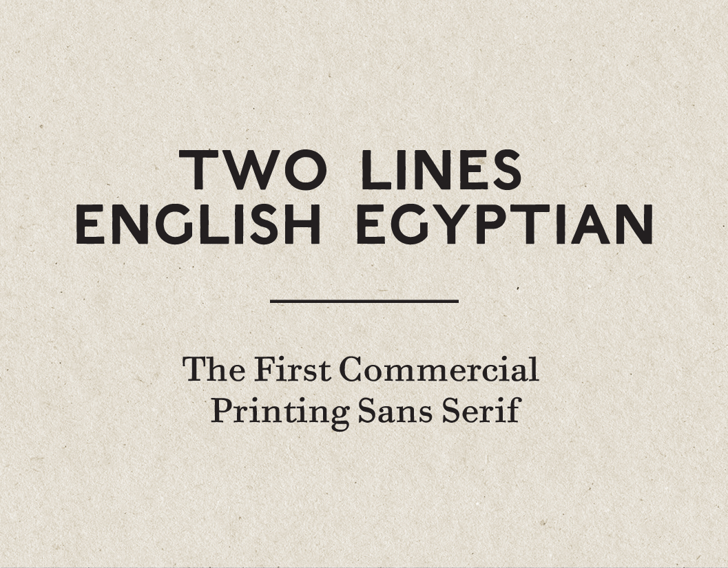
The ‘House of Caslon’ film is a university project which involved producing a short film that told the story of the English typeface designer William Caslon and his printing legacy. As part of this project I was asked to design and produce a 'digital revival typeface’ based on the first ever commercial sans serif typeface which went by the name of ‘Two Lines English Egyptian’. This typeface was produced by the first William Caslon’s grandson, William Caslon Junior and his typefoundry in around 1816.
The project involved reviving the letter forms found in a 'Blake, Garnett & Co.' type specimen book (dateable to 1819) which features a specimen of ‘Two Lines English Egyptian’. These simple, bold sans serif letterforms are all uppercase with no punctuation and read simply 'W CASLON JUNR LETTERFOUNDER'. The specimen, considering it's historical importance, is rather inconspicuously set between lines of bold and italic serifed titling capitals.
With only 14 sample letters from the 26 uppercase alphabet to work with, the project involved interpreting the remaining 12 letters using other later specimens of 'Two Lines English Egyptian'. It was decided that two versions would be produced. The first version faithfully reproduces the letterforms found in the Blake and Garnett & Co. specimen - capturing the hand printed feel with the softened edges and the ink bleed appearance. The second is a cleaned up version which tries to establish what the original woodcut letters would have looked like without the ink bleed and softened edges, which is a feature of the letters once printed.
The typeface was use on the 'House of Caslon' film for titles and headings and on the film's promotional material.


Above & Below: The first printing sans serif, William Calson IV's 'Two Lines English Egyptian', in the 'Blake, Garnett & Co. typespeimen' c.1819. Photograph by Olly Sorsby, 2013. St. Brides Printing Library.


Above: 'House of Caslon' promotional poster A3. Designed by Jonathan Martin, 2013.

Above: 'House of Caslon' film logotype. Designed by Olly Sorsby, 2013.

'Two Lines English Egyptian' was produced as part of a University project
for the film 'House of Caslon'
'Two Lines English Egyptian' Designed & Produced by Jonathan Martin, 2013.
based on the specimen found in the Blake, Garnett and Co. type specimen c.1819,
St. Brides Printing Library.
All Photography by Olly Sorsby
For more information regarding the 'Two Lines English Egyptian'
digital revival please feel free to get in touch!

