What is 'De Stijl' and how did it come about?
De Stijl is Dutch for "The Style" and is also known as neoplasticism, The artistic movement was actually founded in 1917, 'De Stijl' was made up of many members and influences, however probably the most prominent was Theo Van Doesburg who was actually the 'ambassador' of the movement, promoting it across Europe. He moved to Weimer in 1922 to focus further on the Bahaus principle.
It was while reviewing an exposition for one of these magazines he wrote for, in 1915 (halfway through his two-year service in the army), that he came in contact with the works of Piet Mondrian, who was eight years older than he was, and had by then already gained some attention with his paintings. Once Theo Van Doesburg liked the works of Mondrian he then became a fan of other artists that had a similar style of reality but put across in an abstract way, I feel this combined with the modern twist of minimal straight lines and a select pallet of colours was what caught Von Doesburg's eye and together him and Mondrian created the official 'De Stijl' magazine, this was helped set up also by a few artists that Von Doesburg originally liked such as: Bart Van der Leck, Anthony Kok, Vilmos Haszor and J.J.P Oud.
It was while reviewing an exposition for one of these magazines he wrote for, in 1915 (halfway through his two-year service in the army), that he came in contact with the works of Piet Mondrian, who was eight years older than he was, and had by then already gained some attention with his paintings. Once Theo Van Doesburg liked the works of Mondrian he then became a fan of other artists that had a similar style of reality but put across in an abstract way, I feel this combined with the modern twist of minimal straight lines and a select pallet of colours was what caught Von Doesburg's eye and together him and Mondrian created the official 'De Stijl' magazine, this was helped set up also by a few artists that Von Doesburg originally liked such as: Bart Van der Leck, Anthony Kok, Vilmos Haszor and J.J.P Oud.

Here is an example from Van der Leck and although there is a lack of colour you can see what attracted Van Doesburg to Van der Leck's work with the vast variation of rectangles and squares going in several direction and several scales, this alone is the a good representation of the abstract design that inspired the minds of Van Doesenburg and Mondrian to publish the journal. I believe even showing this grayscale image to Van Der Leck would still have impact as intact the Dutchman always had a passion for colourless images and in 1920's released several 'groundbreaking' pieces of black & white paintings.


The two images above show different components of 'De Stijl' design, the first is a vary raw and true example of the kind of typeface that the artists like Von Doesburg felt went with the aesthetic design of posters and paintings, this particular typeface has very little kerning and when put with the de-constructed san serif structure legibility at first glance can be confusing however with just a moment to look at it you then discover the creativity and relativity of projecting the name of the style in a visual way that is straight away linked and that promotes the design aesthetic. The second image shows a very typical De Stijl design piece, with segmented compartments within an overwhelming square/retangle with only selected inputs of colour, I find it interesting how in this particular piece blue,yellow and red are all added which are of cause primary colours, perhaps in a symbolic way this represents the few founders and is saying that they were able to be different and independent from the design protocol in the early 1900's.
The fact that the first magazine they published instigated architectural, sculptural and typographic principle all comes together when the elements are combined, there is no greater example of this than the very first editions front cover...
The fact that the first magazine they published instigated architectural, sculptural and typographic principle all comes together when the elements are combined, there is no greater example of this than the very first editions front cover...

All the principles are combined to form a (for its time) sleek, minimal and stylish piece of design to represent the passions and believes of the artists like J.J.P Oud and Von Doesburg.
From analysing this cover the squared design structure is constantly changing and interlocking with every direction which is defiantly complimentary when aligned with the de-constructured type of the title, this for me is perfect example of the design that these few artists felt so passionately about with the blueprint type layout that signifies architecture, the strutted links that almost create an image which gives the look of sculpture all topped of by the type at the top and the small print below, giving this front cover a rectangular, spacious and minimal outlook that offers so much depth when appreciated. It is no wonder that this movement had such an impact and for a brief time heavily impacted the design world.
From analysing this cover the squared design structure is constantly changing and interlocking with every direction which is defiantly complimentary when aligned with the de-constructured type of the title, this for me is perfect example of the design that these few artists felt so passionately about with the blueprint type layout that signifies architecture, the strutted links that almost create an image which gives the look of sculpture all topped of by the type at the top and the small print below, giving this front cover a rectangular, spacious and minimal outlook that offers so much depth when appreciated. It is no wonder that this movement had such an impact and for a brief time heavily impacted the design world.
How did the design world change after this was introduced ?
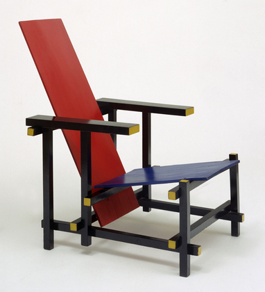
Not only was it framed art and contemporary magazine covers that under took the 'De Stijl look but also furniture, the most iconic example of this was 'The Blue and Red Chair'which was designed at the beginning of the movement in 1917 by Gerrit Rieveld. It represents one of the first explorations by the De Stijl art movement in three dimensions, however you may think it seemed a simple transaction between the artwork and wood work but the look of the chair was bare and brown for nearly 4 years. Although this was built in 1917 the constructed beach wood that it was made from didn't receive a coat of paint until 1920 when fellow member and enthusiast of De Stijl and architect, Bart Van der Leck, saw his original model and suggested that he add bright colours to inject the style and look of Des Stijl for all to see.

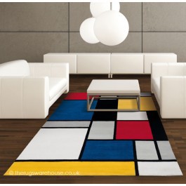
Influences lie in everyday observation and items that our eyes take for granted

Evolved and updated yet still keeping the colour input as the main source of identity
Are these late 20th and 21st century examples products influenced by the movement of the early 20th century ?

Von Doesburg's Architype
Of the artists linked to De Stijl, many drew an alphabet, but it is probably Van Doesburg’s which has been most influential. He drew a sans-serif modular alphabet that is constructed entirely of evenly weighted strokes. Each character is based upon a square divided into a raster of 5x5. This makes some characters, especially the K, R and X, so unconventional that they must have been unreadable to many readers. The earliest version of the alphabet was made up of letterpress ruling pieces. The finished typeface was used in 1919.
I personally find it interesting how there seemed to be similarities between the early 1900's design movement typography and the second world war propaganda typography that was shown in Russia...


If you look at the typography of these two completely different examples you can see traits and components that are easily traceable to the De Stijl typefaces like Von Doesburg's architype.
The first example that I have is a 20th century propaganda poster is now held in Israel but the letter structure it self it built from different components that come together (very much like men come together to form an army or nation) to form a typographic message that is made the the soul purpose to rally and invoke confidence into the viewer.
The link in the second example is also apparent with the squared structure of letters and X and Y axis principles which is used in this scenario as symbolism in my eyes, its saying its bold, upright and proud which is defiantly relatable when looking back at what the De Stijl movement wanted, this is evident as they were so passionate for getting this new style of design out to not just the design world but common on looker they founded and published a the 'De Stijl' magazine/journal.
'Supremastism' Influences
This then leads me nicely onto the 'Supremistism' state of russian design which came about slightly before 'De Stijl' in 1915, this was an art movement, focused on basic geometric forms, such as circles, squares, lines, and rectangles, painted in a limited range of colours, which is most probably where Von Doesburg picked up on the futuristic style (although not stated).
This then leads me nicely onto the 'Supremistism' state of russian design which came about slightly before 'De Stijl' in 1915, this was an art movement, focused on basic geometric forms, such as circles, squares, lines, and rectangles, painted in a limited range of colours, which is most probably where Von Doesburg picked up on the futuristic style (although not stated).


(Below)
This is a very famous piece by Kazimir Severinovich Malevich who was a Russian painter and art theoretician. He was a pioneer of geometric abstract art and the originator of the avant-garde Suprematist movement.
This is a very famous piece by Kazimir Severinovich Malevich who was a Russian painter and art theoretician. He was a pioneer of geometric abstract art and the originator of the avant-garde Suprematist movement.

Once I looked into the supremastism design of a couple years prior to 'De Stijl' it was heavily apparent that the short bursts of lines and colours had already been out there however when you compare the two, to me it seems that the Von Doesburg and Co. way of presentation was calmer, more structured and disciplined and to me that was gives 'De Stijl' the superiority because unlink the Suprematistic movement the Dutch movement had components like architecture, sculpture and most important of all a strong typographic influence embedded into the design all the while making the Dutch style a lot more commercial.
(Similar design below from the De Stijl movement.)
(Similar design below from the De Stijl movement.)

This is a key example, Theo van Doesburg's 'Simultaneous Counter' which like the Suprematistic example above is constructed through vertical and horizontal geometric lines and shapes. The main difference for me however comes in the method of how these two pieces were done. I feel the De Stijl example appears digitally re-enforced compared to the stripped paint style of the suprematism version, the colours seem a lot bolder and intense even though there are less shapes, saying that this wasn't always the case as sometimes this had to be toned down in a poster or commercial appearance as not to compete with the type that it was placed with (Example below).

This is a typography example that I find diverse and modern because of the joined and clinical structure whilst still keeping the straight edges and equal spacing for the crevasses that gives the typical 'De Stijl' typeface an identity that is unique.


Here we have a two quirkier looking piece with less regard for placement. The direction of type in both is drastic with the top example taking a vertical route and even being split in half to make room for other type and the bottom then takes a diagonal direction which isn't that characteristic in 'De Stijl' design as you can can see it in lots of the shape based work with diagonal lines and diamond shaped implements, The inverted colours give a linking component that to me shows a bit of adventure and quest something new and revolutionary which in the 1900's would have been drastic. This may contain a lot of type direction however the Dutch discipline still rounds the type design up with the rectangle that is been formed by the 90 degree corner formed by type.

This was an exhibition poster created by Bart van der Leck in 1919 and has the picture of a man on a horse made out of simple segments which is an other example of the sculptured roots shown in the principles of De Stijl design.
To conclude
Does 'De Stijl' typography and design still have a place and influence in todays world?
Yes I believe it does, many aspects we see in everyday designs today stem from that period of structuring type in a harsh and regimented fashion whether that be in a military look (Recruiting adverts, movie posters, book covers, designers like jean paul gaultier etc.)
