Understanding Josef Alber's Interaction of Colour
Josef Albers was an artist and educator, well known for his design, photography, typography, paintings, printmaking, and poetry. He is considered to be one of the most significant teachers of the visual arts to have emerged from the past century, he taught at the Bauhaus as well as the Black Mountain College. While he also developed one of the most extensive and influential courses on colour. Alber’s believed that formal knowledge about the order of colour, would be of little practical use to his students if they didn’t understand the elasticity of colour. For instance while you can do your best to learn about the conventional elements of art such as how to create a harmonious palette, when applied in context, colour is beguiling and deceptive. It will change according to its interaction and placement of other hues. He observed and explored these universal quirks in his book, The Interaction of Colour.
“In visual perception a color is almost never seen as it really is—as it physically is. This fact makes color the most relative medium in art. In order to use color effectively it is necessary to recognize that color deceives continually. To this end, the beginning is not a study of color systems.”
Alber’s outlined that colour is complex, and he challenged common assumptions about perception. He defined factual colour (local colour), as colour in isolation; it is rule based, fixed and absolute. In contrast he established the notion of actual colour (colour in context); as fluid, contingent and integrated.
Alber’s teachings presented a direct observation on the behaviour of colour and he asserted that only by studying colour in context, can one start to comprehend its true nature. He explains that students can only begin to understand the beguiling state of colour through the experience of trial and error. In his lessons he championed practice over theory, and his book The Interaction of Colour was a result of that experimentation. His saw his students as his co-collaborators, and the examples seen within the pages of the book were made by them, as direct solutions to problems he assigned. For instance the artworks below are in response to the brief’s he set.

Make one colour look like two
“The inner smaller violets are
factually alike.
But the upper one appears to refer to
the outer lighter violet at the bottom.”
However Alber’s was not the first to investigate the flexibility of colour. For example take a look at this painting by Degas’ and observe what assumptions you make about the red of the ballerinas jumper on the left. You might assume that the factual colour has a slight orange hue, however on further investigation when in isolation that red appears much darker than it does on this canvas. This is highlighted in the following diagram in which I have isolated the colours.

(Edgar Degas, The Dance Lesson, ca. 1879)
“Painting is the ability to surround a Venetian red so it looks like vermillion. ”

Simultaneous Contrast
When a hue is surrounded by a complementary colour, the colour interacts and changes in our perception. The red square above appears darker than the square below, which appears lighter to the eye. The Impressionists were interested in this interaction, otherwise known as simultaneous contrast. When colour casts a shadow tinged with that of its complementary colour, it appears differently on the canvas compared to what it may actually be in reality.
“The fact that the after-image or simultaneous contrast is a psycho-physiological phenomenon should prove that no normal eye, not even the most trained one, is foolproof against color deception. He who claims to see color independent of their illusionary changes fools only himself, and no one else.”

“Make one colour look like two”
Following Alber’s experimental ethos, I decided to try my hand at a one of the problems he assigns within the book. The result of which you can see here.
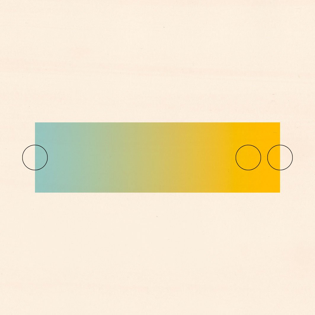
Solution
The colours I chose to solve this problem are circled. I chose blue for the left, and a complimentary yellow to the right. The yellow squares are factually alike, and are a close relative to the yellow rectangle. However when in context the square on the right appears far more muted than the other.
“Color, in my opinion, behaves like man in two distinct ways: first in self-realization and then in realization of relationships with others.”
This phenomena of simultaneous contrast can also be applied to our other senses. For instance, if you’ve had the experience of brushing your teeth and followed by drinking a glass of orange juice then you will of encountered this reaction on your sense of taste; the sweetness of the orange juice will taste strange and bitter. Similarly,
in the Interaction of Colour, Alber’s describes a straightforward experiment with water and touch. Using commonplace items, the goal was to challenge students sensations and increase awareness to the different ways the world can be viewed and experienced, as illustrated below.

Haptic Illusion
The exercise works as a philosophical tool to allow students to feel the simultaneous perception of different things from the same source. It’s an illuminating exercise which demonstrates how the body operates, suggesting language such as hot and cold are immeasurable words but at the same time are deeply significant to us.
A contemporary audience may already be aware of the interchangeability of colour, for instance you may of experienced the magic of Op-Art, a movement influenced by Alber’s work. At the time of it’s publication The Interaction of Colour was seen as a groundbreaking text exploring art, psychology and science. The thought provoking exercises and mind-bending optical illusions were not only about colour, but about perception itself and how we experience the world around us. Like colour, his teachings assert that everything is relative, and this notion can be carried through into life.
The Interaction of Colour was originally published in 1963, after 30 years of extensive teaching. Since then it’s been printed numerous times worldwide. In 2013 Yale developed an interactive iPad app to mark the 50th anniversary, which further fulfils Alber’s intent of the book being accessible and an on going enquiry. If you enjoyed this article you may find my online courses helpful in developing your understanding of visual language, perspective and different drawing techniques.
