How to Amplify Your Research Poster Presentation
We’ve all been there. You have 15 minutes to see the 25 posters that you put on your schedule. You enter the room and there are people everywhere and posters up and down the aisles. You peak your head over the one you really wanted to see and have to squint to understand what the gist of it is. You finally get to the front and end up taking a picture of it (with permission from the author of course) and then go on your way. You never look at that picture again.
The scientific poster presentation (also called the academic poster presentation or research poster presentation) is getting a much-needed makeover. Having a lot of small text on a poster to fit in all the information can be really challenging to the person reading it. It also is a struggle to make sure you are sharing the information with your target audience and allowing them to use the information or discuss what it is you actually want them to take away.
I’ve learned a few things along the way in creating unique, creative poster presentations and I want to share a snapshot of a few strategies that can help amplify and make your poster stand out. More importantly, it will help you find the people you are looking to share the information with!
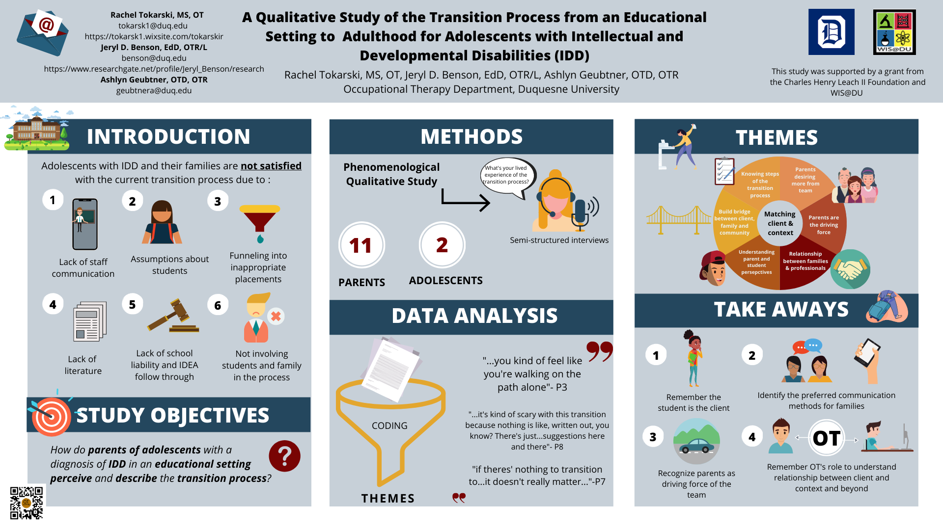
Here’s an example of a poster presentation I did that reviews this research paper.
Here are some strategies I would recommend to use for your research poster presentation:
Keep the same formatting of headlines so others understand the general flow
Try to replace as much text with images as possible
If you do have charts, ensure that they are clearly labeled and that the labels are big enough to read from a distance or the entire image is understandable at a glance
Have key takeaways large and with visuals for people to see from a distance
Have contrast between text and background
Have an icon or image at the top showing what the general topic is (i.e. hands for hand therapy)
Add a QR code for people to access your handouts
Poster presentation designs were the first thing I started with at OT Graphically and I was excited to share them at the American Occupational Therapy Association’s conference in March of 2020. But sadly, it was canceled and I never got to share a lot of the designs I made. Last year I was able to support four posters, including my own, and I was happy with the outcome, the engagement, and the connections I made with others. I felt as though the poster allowed me to share the information with the right audience because I had clearly spelled out what I was working on.
Need more help or getting stuck with you poster? Reach out to us at katie@otgraphically.com or schedule a 15-minute consult to discuss ideas and stuck points.
