The Art of a Heartfelt Redesign
Southwest Airlines' new logo and accessible font is a case study in how iconography conveys the human values of large corporations.
Southwest Airlines recently got a brand new heart—and a custom typeface to match. The new logo and font, unveiled last September, were commissioned as part of the airline's “brand refresh,” a redesign aimed at updating the company’s look without changing its overall tenets. According to Rodney Abbot, a senior partner at Lippincott (the storied agency that directed the change), the makeover was about “uncovering the true Southwest, not about creating a new Southwest.” As the craft of branding evolves and expands across all businesses, it's a textbook example of how companies express their values through design.
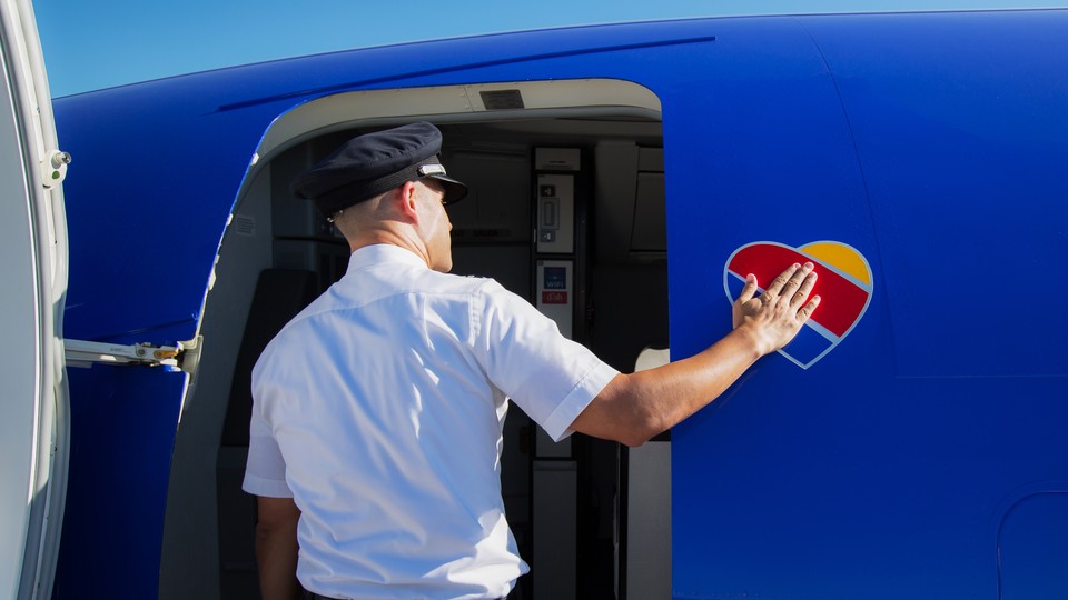
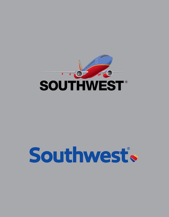
Southwest wanted to capitalize on its reputation for humanity and customer loyalty while also making a new, visual bid to attract customers. The first stage was to replace its two separate logos: the “Winged Heart” and the “Take-Off” symbol (a plane in flight over their name) Their updates, Lippincott said, aimed for a modern look that also demonstrated that “despite its fun-loving personality, Southwest Airlines is a really buttoned-up operation.”
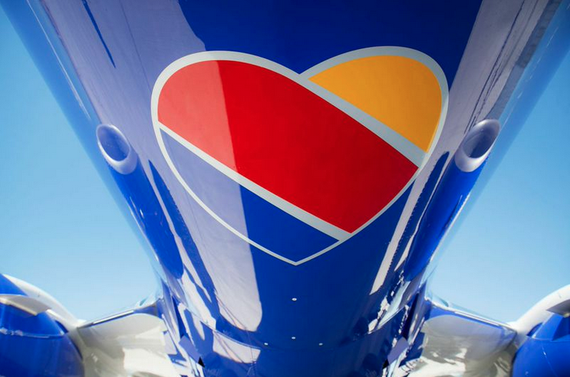
Although not the freshest graphic icon in the logo-making toolkit, the heart is appropriate: Southwest’s home base is at Love Field Airport in Dallas, TX; its stock symbol is LUV. Yet the heart, which has always been a part of the Southwest identity, was hackneyed for the company: Hundreds of variations appeared in both internal and customer-facing communications. “To overcome this,” Abbot said, “we decided to … elevate it."
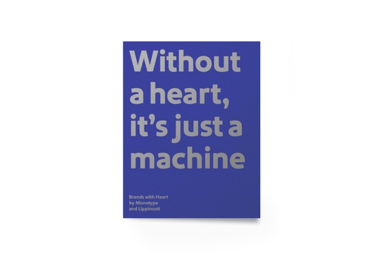
The colorful, updated heart “symbolizes care,” Abbot said, and is accompanied by the line “Without a heart, it’s just a machine.” This makes it, in other words, a brand story, or an expression of company ideas and working theories.
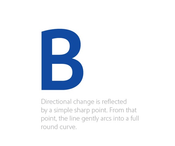
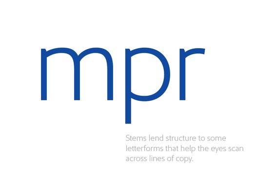
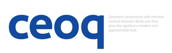
The new icon was accompanied by a revamped typeface. Monotype’s Dan Rhatigan and Jim Ford designed Southwest Sans, an easy-reading face that is nevertheless a tonal shift from the ultra-neutral Helvetica face that Southwest had been using. Rhatigan explained that the difference was crucial: “Southwest Sans has more open forms, and some warmer, simplified shapes compared to Helvetica, which should make it easier to take in words at a glance.” Also, he said, by switching from a typeface as widely used as Helvetica, “even the simplest uses will display a touch of personality.”
Abbot, who collaborated with Monotype to produce a booklet about how typefaces can bring versatility and warmth to a corporation, said Southwest’s redesign speaks to a broader shift in the way that businesses interact with their customers. “After decades spent polishing their appearances, brands today are embracing their more human sides," he said. “The hope is that the Collection inspires those undergoing a rebrand to deeply think about the role typography plays in communicating their story and to connect in truly authentic ways.”